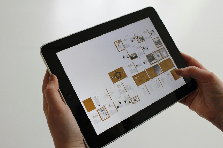
When designing for thumb-friendly navigation, you need to contemplate how users hold their devices and which areas are easiest to reach with one hand. Proper placement of controls can considerably reduce strain and increase ease of use, especially during prolonged interactions. But achieving the perfect layout involves more than just positioning—there are subtle factors that can make or break the user experience. Understanding these nuances can help you create more intuitive, comfortable interfaces that keep users engaged.
Understanding Thumb Reach Zones
Since your thumb has limited reach when holding a phone, understanding its natural movement zones is essential for designing user-friendly navigation. By studying ergonomic hand positioning, you can identify the areas where your thumb moves most comfortably. Real-time SEO insights can help ensure that your design remains optimized for user engagement on mobile devices. Thumb motion ranges vary from the tip to the base, with certain zones offering easier access than others. Typically, the most reachable zones are near the bottom and center of the screen, while the outer edges pose more strain. Recognizing these zones helps you place key interactive elements within easy thumb reach, reducing user effort and frustration. Designing with thumb motion ranges in mind ensures your app feels intuitive, natural, and comfortable, encouraging longer engagement. Properly considering thumb reach zones creates a seamless experience that adapts to how users naturally hold and maneuver their devices.
Prioritizing Key Interactive Elements
How can you guarantee users interact with the most important features effortlessly? Focus on prioritizing key interactive elements for one handed usability. Position essential controls within the thumb’s natural reach zone, reducing the need for awkward stretches or multiple gestures.
Incorporate gesture based controls to streamline interactions, allowing users to quickly access functions with simple swipes or taps. Keep critical buttons and features close to the bottom center of the screen, where your thumb naturally rests.
Avoid cluttering the interface with less important options that force users to stretch or reposition their hand. By emphasizing key elements and leveraging gesture based controls, you create a seamless, intuitive experience that encourages effortless, thumb-friendly navigation with minimal effort.
Simplifying Navigation Patterns
Building on the idea of prioritizing key interactive elements, simplifying wayfinding patterns guarantees you can move through your app or site with minimal effort. Use gesture controls like swipes, taps, and pinches to replace complex menus, making wayfinding more intuitive and thumb-friendly.
Incorporate one-handed modes that shift key actions closer to your thumb’s natural reach, reducing strain. Avoid cluttered layouts and nested menus that force excessive navigation steps. Instead, streamline pathways so users can quickly access main features with minimal gestures.
Consistent, simple patterns help users memorize navigation routes, enhancing ease of use. By simplifying these patterns, you create a seamless experience that feels natural, quick, and accessible for anyone navigating your digital space with one hand.
Optimizing Button and Link Placement
To enhance thumb-friendly navigation, place your most important buttons and links within easy reach of your thumb’s natural movement zone, typically the lower half of the screen’s right side for right-handed users. This aligns with gesture ergonomics, reducing strain and improving usability.
Guarantee that interface spacing between buttons and links is adequate to prevent accidental taps and allow for comfortable navigation. Avoid cluttering this area; prioritize essential actions to minimize movement.
Consider large, touch-friendly targets that accommodate natural thumb motion, making interactions seamless. Proper placement reduces user effort and speeds up navigation, creating a more intuitive experience.
Testing and Refining for Comfort
Testing and refining for comfort is essential to guarantee your navigation design truly meets user needs. Focus on gesture ergonomics to ensure gestures are natural, easy to perform, and minimize strain.
Observe how users interact with your interface during testing, paying attention to awkward movements or excessive thumb stretch. Collect user feedback actively, asking about comfort levels and any discomfort experienced during navigation.
Use this input to identify pain points and adjust button placement, gesture sensitivity, or layout. Iterative testing helps you refine your design, making navigation smoother and more comfortable for everyday use.
Conclusion
By focusing on thumb-friendly design principles, you create a more comfortable, efficient experience for users. Prioritize placing key elements within the thumb’s natural reach, simplify navigation, and optimize button placement. Regular testing helps you refine these elements for maximum comfort and usability. When you design with ergonomics in mind, you reduce user fatigue and make one-handed interactions effortless, encouraging prolonged engagement and a better overall experience. For more information on how to improve your web design and SEO, visit us online at [SEO ONE](https://www.seoone.com).


