A website is one of the most important marketing assets a business owns. Long before a customer calls your office, fills out a form, visits your location, schedules an appointment, or makes a purchase, they often visit your website first. In many situations, your website creates the first real impression of your business. That first impression can either build trust, create interest, and encourage action, or it can create confusion, doubt, and hesitation.
Many business owners believe that a successful website is simply a website that looks attractive. While professional design is important, appearance alone does not make a website successful. A beautiful website that loads slowly, has confusing navigation, lacks clear messaging, or does not show up in search engines will struggle to produce results. On the other hand, a strategic website can become a powerful marketing tool that works every hour of the day, every day of the week.
Successful web design is the combination of many important elements. It includes visual design, user experience, mobile performance, website speed, content strategy, search engine optimization, branding, trust building, accessibility, analytics, security, and conversion strategy. When all of these pieces work together, a website becomes more than an online brochure. It becomes a business growth engine.
A good website should help visitors understand who you are, what you offer, why they should trust you, and what they should do next. It should answer common questions, remove doubt, create confidence, and make it easy for people to take action. The goal is not simply to impress visitors. The goal is to move them closer to becoming customers, clients, members, subscribers, donors, or leads.
This guide explains the most important elements of successful web design. Whether you are building a brand new website, redesigning an older site, or improving a website that is not producing enough results, these principles can help you create a stronger online presence.

Chapter 1, Understanding the Purpose of Your Website
Before a website is designed, written, or developed, the first step is understanding its purpose. Every successful website begins with a clear goal. Without a clear goal, a website can easily become cluttered, confusing, and ineffective.
A business website may have several possible goals. It may be designed to generate leads, sell products, schedule appointments, educate visitors, build brand awareness, provide customer support, recruit employees, or collect donations. Some websites need to accomplish more than one of these goals, but even then, there should still be a primary objective.
For example, a roofing company may want its website to generate phone calls and inspection requests. A law firm may want consultation requests. A church may want visitors to learn about services, ministries, and upcoming events. An ecommerce store may want visitors to browse products and complete purchases. A software company may want free trial signups. Each of these websites requires a different design approach because each one serves a different purpose.
When the purpose is unclear, the website often tries to do too much at once. This creates confusion. Visitors may not know where to click, what information matters most, or what step they should take next. Confused visitors rarely convert.
Before building or redesigning your website, ask several important questions. Who is the website for? What problem does the visitor need solved? What action should the visitor take? What information does the visitor need before taking that action? What makes your business different from competitors? What objections might visitors have? What proof can you provide to help them feel confident?
These questions help create a strategic foundation. Every page, headline, image, section, and button should support the larger goal of the website. If something does not help the visitor or support the business objective, it may not belong on the page.
A successful website is not built around what the business wants to say. It is built around what the visitor needs to know. This is an important difference. Many companies fill their websites with company history, generic statements, and industry language. Visitors are usually more interested in how the business can help them, what results they can expect, and why they should trust the company.
When the purpose is clear, the website becomes easier to plan. The homepage can be structured around the main message. Service pages can focus on customer needs. Calls to action can be placed in the right areas. Content can be written to answer real questions. Design decisions can be made with confidence because every choice supports a defined goal.
Chapter 2, First Impressions Matter
Visitors form opinions about a website very quickly. Within seconds, they begin deciding whether the business seems professional, trustworthy, helpful, and relevant. This is why the first impression of a website matters so much.
The homepage is often the first page visitors see, but every major page should be designed as a possible entry point. Visitors may arrive from Google, social media, email, paid ads, referrals, or direct links. They may land on a blog post, service page, product page, pricing page, or contact page. Because of this, each important page should quickly communicate value.
A strong first impression answers four basic questions. Who are you? What do you do? Who do you help? What should the visitor do next? If a visitor cannot answer these questions quickly, the website may lose them.
One common mistake is using vague headlines. A headline like, Welcome to Our Website, does not tell visitors anything useful. A stronger headline explains the value clearly. For example, Helping Local Homeowners Get Fast, Reliable Roof Repair, immediately tells visitors what the company does and who it helps.
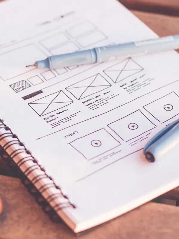
Visual design also plays a major role in first impressions. A website should look clean, modern, organized, and consistent. Outdated design can make a business appear outdated, even if the company provides excellent service. Poor spacing, hard to read text, low quality images, and cluttered layouts can create doubt.
However, visual design should never distract from the message. The best designs support the content. They guide attention toward the most important information and make the next step easy to understand.
Trust is also part of the first impression. Visitors want to know that they are dealing with a real, credible business. This can be supported through reviews, testimonials, certifications, awards, professional photos, years of experience, case studies, media mentions, security indicators, and clear contact information.
The first impression should also create emotional clarity. Visitors should feel that they are in the right place. If someone is searching for emergency plumbing help, the website should quickly communicate urgency, availability, and reliability. If someone is searching for luxury travel planning, the website should communicate elegance, expertise, and personalized service.
A strong first impression does not happen by accident. It is created through clear messaging, professional design, fast loading speed, trust signals, and a strong call to action.

Chapter 3, Mobile Friendly Design
Mobile friendly design is no longer optional. Many visitors now browse websites from phones and tablets more often than desktop computers. If your website does not work well on mobile devices, you may be losing potential customers every day.
Responsive design allows a website to adjust automatically to different screen sizes. This means the website should look good and function properly on phones, tablets, laptops, and desktop monitors. Text should be readable, images should resize correctly, buttons should be easy to tap, and menus should be simple to use.
Mobile visitors often behave differently than desktop visitors. They may be in a hurry. They may be looking for a phone number, directions, service details, pricing, reviews, or a quick way to contact the business. A mobile website should make these actions simple.
Important mobile design features include click to call buttons, easy contact forms, readable font sizes, simple navigation, fast page loading, properly sized images, and clear calls to action. The user should not have to pinch, zoom, scroll sideways, or search endlessly for basic information.
Mobile design also affects search engine performance. Search engines want to provide users with websites that work well on their devices. A website that is difficult to use on mobile may struggle in search results, especially for competitive keywords.
Another important part of mobile design is spacing. Buttons should not be too close together. Form fields should be easy to select. Text should not be crowded. White space helps mobile users move through content without feeling overwhelmed.
Mobile forms should also be simple. Asking for too much information can reduce conversions. In many cases, a name, phone number, email address, and short message field are enough. The easier the form is to complete, the more likely visitors are to submit it.
Images and videos should also be optimized for mobile. Large files can slow down page speed, which frustrates users and reduces conversions. A beautiful image is not helpful if it causes the page to load slowly.
A mobile friendly website should feel natural, fast, and easy. Visitors should be able to move from interest to action without frustration.
Chapter 4, Website Speed and Performance
Website speed is one of the most important parts of web design, but it is often ignored until problems appear. A slow website can hurt user experience, search rankings, lead generation, and sales.
Modern visitors expect websites to load quickly. If a page takes too long to appear, many people will leave before they ever see your content. This is especially true on mobile devices, where users may have slower connections or less patience.
Several factors can slow down a website. Oversized images are one of the most common problems. Many websites upload photos directly from a camera or design file without compressing them. These images may look good, but they can be far larger than necessary. Optimizing images can greatly improve speed.
Too many plugins can also slow down a website. This is common with content management systems like WordPress. Plugins can add useful features, but every plugin may add code, scripts, or database requests. A website should only use plugins that are truly needed.
Poor hosting is another major issue. Cheap hosting may save money at first, but it can cost more in lost leads and poor performance. A strong hosting environment can improve speed, reliability, security, and uptime.

Unoptimized code, excessive scripts, large videos, unused files, lack of caching, and too many third party tools can also create performance problems. Every added feature should be evaluated carefully. If it does not improve the user experience or support business goals, it may not be worth the performance cost.
Speed also affects trust. A fast website feels professional and dependable. A slow website feels outdated or unreliable. Visitors may assume that if the website performs poorly, the business may also be poorly managed.
Improving speed can include compressing images, using modern file formats, reducing unnecessary code, enabling browser caching, using a content delivery network, improving hosting, minimizing redirects, and removing unused scripts.
Website speed should not be treated as a technical detail only developers care about. It directly affects business results. A faster website can produce more leads, more sales, better engagement, and stronger search visibility.
Chapter 5, Navigation and User Experience
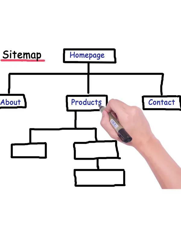
Navigation is the roadmap of your website. It helps visitors find what they need and move through the site with confidence. Poor navigation creates frustration, and frustrated visitors often leave.
Good navigation should be simple, clear, and logical. Visitors should not have to guess where information is located. Menu labels should use familiar words. For example, Services, About, Reviews, Pricing, Blog, and Contact are clear labels. Creative or unusual labels may look interesting, but they can confuse users.
A website should be organized around visitor needs. Many businesses organize pages based on internal company structure, but visitors do not think that way. They want to find answers quickly. They want to know what services are offered, how much things cost, where the business is located, what other customers say, and how to get started.
The main navigation should include the most important pages. Too many menu items can overwhelm users. If a business has many services, a dropdown menu may be helpful, but it should still be organized clearly.
User experience includes more than navigation. It includes the overall ease of using the website. A good user experience helps visitors move smoothly from one step to the next. The website should feel intuitive. Pages should load quickly. Text should be easy to read. Buttons should be easy to find. Forms should be simple. Important information should not be hidden.
One helpful way to evaluate user experience is to imagine a first time visitor using the website. Can they understand what you do within a few seconds? Can they find your services? Can they contact you easily? Can they see reviews or proof of your work? Can they take the next step without confusion?
Internal links also improve user experience. When a page mentions a related service, article, or resource, linking to that page helps visitors continue learning. Internal links also help search engines understand the structure of your site.
A website should guide visitors, not make them work. The easier it is to use, the more likely it is to convert.
Chapter 6, Calls to Action
Every page on a website should encourage visitors to take a next step. This is where calls to action become important. A call to action tells visitors what to do next.
Common calls to action include Contact Us Today, Request a Quote, Schedule a Consultation, Book an Appointment, Download the Guide, Start Your Free Trial, Call Now, Get Pricing, or Join Today.
A good call to action is clear, direct, and relevant. It should match the visitor’s intent. Someone reading a service page may be ready to request a quote. Someone reading an educational article may prefer to download a guide or contact the company for more information.
One common mistake is using weak button text. A button that says Submit is not very motivating. A button that says Get My Free Estimate is stronger because it tells the visitor what they receive.
Calls to action should be visible throughout the website. They should appear near the top of important pages, after key sections, and at the bottom of pages. On long pages, multiple calls to action are usually helpful because visitors may be ready to act at different points.
Design also matters. Buttons should stand out from surrounding content. They should be large enough to notice, especially on mobile devices. They should use action oriented language and be placed where visitors naturally look.
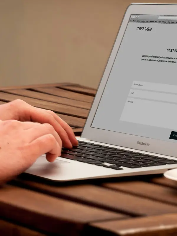
The best calls to action reduce uncertainty. Instead of simply saying Contact Us, a service business might say Schedule Your Free Consultation. This tells the visitor what happens next and removes some hesitation.
Calls to action should also align with the business goal. If the main goal is phone calls, the phone number should be highly visible. If the main goal is online bookings, the booking button should be prominent. If the main goal is lead generation, the form should be simple and easy to complete.
A website without clear calls to action may educate visitors but fail to generate results. Visitors need guidance. A strong call to action provides that guidance.
Chapter 7, High Quality Content
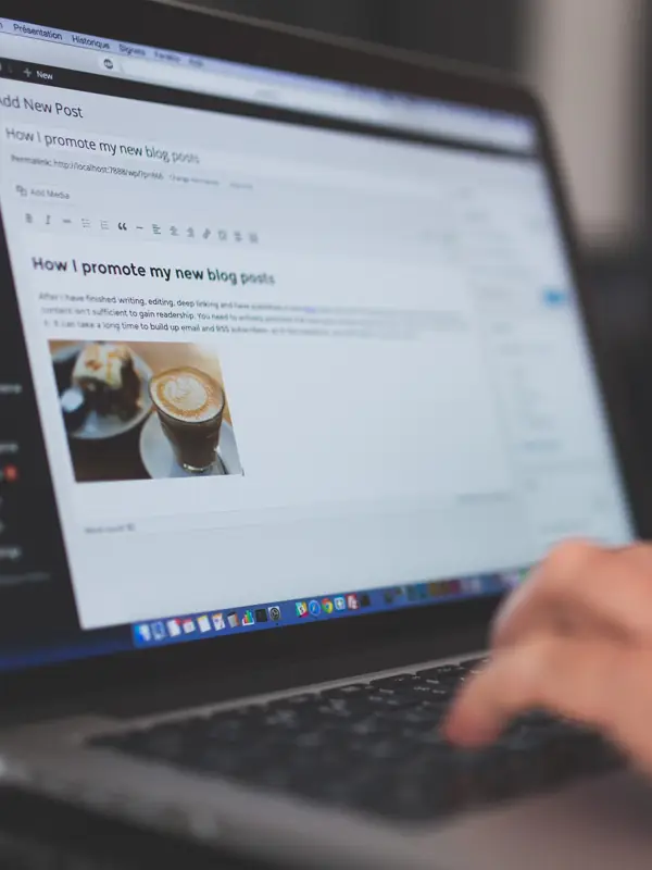
Content is one of the most important parts of a website. Design attracts attention, but content provides the information visitors need to make decisions.
High quality content educates, answers questions, builds trust, demonstrates expertise, and supports search engine rankings. It helps visitors understand your products, services, process, pricing, benefits, and experience.
Good content should be written for people first. It should be clear, helpful, and easy to understand. Avoid unnecessary jargon unless your audience expects it. Most visitors want simple explanations, not complicated industry language.
Every important service or product should have its own dedicated page. This helps visitors find specific information and helps search engines understand what your business offers. A business that offers roofing repair, roof replacement, storm damage repair, and commercial roofing should not place everything on one short services page. Each service deserves clear explanation.
Content should answer common customer questions. What is included? How does the process work? How long does it take? What does it cost? What makes your company different? What should customers expect? What problems do you solve? What areas do you serve?
Blog articles and resource pages are also valuable. They allow businesses to answer educational questions and attract visitors who are still researching. For example, a dentist might publish articles about teeth whitening, dental implants, emergency dental care, and insurance questions. A home service company might publish articles about maintenance, repairs, warning signs, and cost factors.
High quality content should also include proof. Claims are stronger when supported by reviews, examples, photos, case studies, certifications, statistics, or real project details. Instead of simply saying, We provide excellent service, show evidence through testimonials and results.
Content should be organized for easy reading. Use clear headings, short paragraphs, helpful lists, and logical flow. Many visitors scan before they read. Headings help them find the sections that matter most.
Content is not something to add after the design is finished. It should guide the design. The structure of the page should be built around the message.
Chapter 8, Search Engine Optimization
Search engine optimization, often called SEO, helps people find your website through search engines. Without SEO, even a well designed website may not receive enough traffic.
SEO begins with understanding what people search for. Keyword research identifies the words and phrases potential customers use when looking for your services, products, or information. These keywords should guide page topics, titles, headings, and content.
Every important page should have a clear keyword focus. For example, a local painting company may need pages for interior painting, exterior painting, cabinet painting, commercial painting, and specific service areas. Each page should be written to answer the search intent behind that keyword.
Page titles and meta descriptions are important because they help search engines and users understand the page. A strong title should include the topic and location when relevant. A strong meta description should summarize the value of the page and encourage clicks.
Headings also matter. The main heading should clearly describe the page. Supporting headings should organize the content into helpful sections. This helps both visitors and search engines.
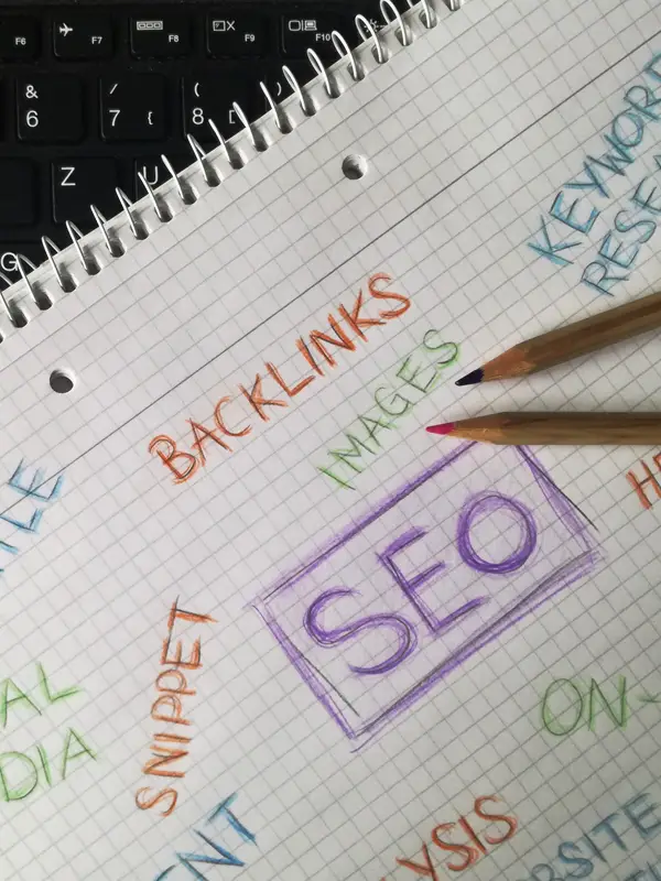
Internal linking supports SEO by connecting related pages. For example, a blog post about signs you need roof repair should link to the roof repair service page. This helps visitors take the next step and helps search engines understand the relationship between pages.
Image optimization is another important factor. Images should have descriptive file names and alt text. This improves accessibility and can help search engines understand image content.
Local SEO is especially important for businesses that serve specific areas. Local pages should include location specific content, service area information, contact details, reviews, and clear business information. Consistency across directories, maps, and the website also matters.
SEO is not a one time task. It requires ongoing content creation, technical improvements, performance monitoring, and updates. Search engines change, competitors improve, and customer behavior evolves. Websites that continue improving usually perform better over time.
The best SEO strategy focuses on being genuinely useful. Search engines want to show helpful results. If your website provides clear, valuable, trustworthy content, it has a better chance of earning visibility.

Chapter 9, Building Trust Through Design
Trust is one of the most important factors in website success. Visitors are often cautious online. They want to know whether your business is legitimate, experienced, reliable, and safe.
Trust can be built through both design and content. A clean, professional design creates an immediate sense of credibility. Outdated design, broken links, poor spelling, low quality images, or confusing layouts can create doubt.
Customer reviews are one of the strongest trust signals. People often trust other customers more than they trust advertising. Displaying reviews, testimonials, ratings, and customer stories can help visitors feel more comfortable.
Case studies are also powerful. A case study shows how your business helped a real customer solve a real problem. It can include the challenge, the solution, and the result. This is especially useful for service businesses, agencies, consultants, and companies with higher priced offers.
Professional photography can build trust because it shows the real people behind the business. Team photos, office photos, project photos, and behind the scenes images often feel more authentic than generic stock photos.
Certifications, awards, licenses, memberships, guarantees, and years of experience can also strengthen credibility. These details should be visible but not overwhelming.
Clear contact information is another trust factor. Visitors should be able to find your phone number, email address, location, and contact form easily. A website that hides contact information may seem suspicious.
Security also affects trust. Visitors want to know that their information is protected. An SSL certificate, secure forms, privacy policy, and professional checkout process are important, especially for websites that collect personal or payment information.
Trust is not created by one element. It is created by the entire experience. Every page should make visitors feel more confident, not more uncertain.
Chapter 10, Branding and Consistency
Branding is more than a logo. It is the overall identity and personality of a business. A strong brand helps visitors recognize, remember, and trust your company.
A website should reflect the brand consistently. This includes colors, fonts, images, tone of voice, messaging, layout style, and overall feeling. Consistency makes a business look more professional and organized.
Brand colors should be used intentionally. Too many colors can create visual confusion. A focused color palette helps create a clean and memorable design. Colors can also guide attention toward important actions, such as buttons and forms.
Typography also matters. Fonts should be readable and appropriate for the brand. A law firm, medical practice, church, roofing company, and luxury travel agency may all need different visual styles. The typography should support the brand personality while remaining easy to read.
Voice and tone are also part of branding. Some brands should sound warm and personal. Others should sound professional and authoritative. Others may sound bold, modern, or energetic. The writing style should match the audience and the business.
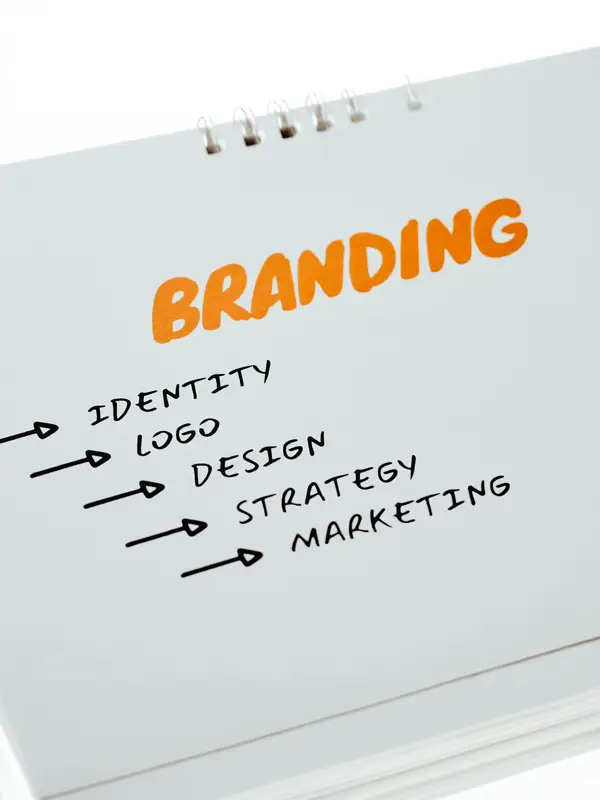
Consistency should extend beyond the website. The website should feel connected to social media profiles, email marketing, printed materials, business cards, videos, ads, and signage. When all materials feel connected, the brand becomes stronger.
A consistent brand creates familiarity. Familiarity creates trust. Trust supports conversions.
Chapter 11, Accessibility
Accessibility means designing a website so that as many people as possible can use it, including people with disabilities. Accessibility is both the right thing to do and a smart business practice.
An accessible website helps people who use screen readers, keyboard navigation, captions, larger text, high contrast settings, or other assistive tools. It also improves usability for everyone.
Important accessibility practices include adding alt text to images, using proper heading structure, making sure text has enough contrast, allowing keyboard navigation, using descriptive link text, labeling form fields clearly, and avoiding design elements that depend only on color.
Readable fonts are also important. Text should be large enough to read comfortably. Paragraphs should not be too dense. Line spacing should help the eye move naturally through the content.
Videos should include captions when possible. This helps people who are deaf or hard of hearing, and it also helps users who watch videos without sound.
Forms should be accessible as well. Each field should have a clear label. Error messages should be easy to understand. Users should know what information is required and how to correct mistakes.
Accessibility also improves SEO in many ways. Clear headings, alt text, organized content, and readable structure help search engines understand pages better.
A website should not exclude potential visitors. Making a website accessible expands the audience, improves user experience, and demonstrates professionalism.
Chapter 12, Website Security
Website security protects both your business and your visitors. In today’s online environment, security is not optional.
The most basic security feature is an SSL certificate. This creates a secure connection between the website and the visitor. Websites with SSL show HTTPS in the address. Without SSL, browsers may warn users that the site is not secure, which can damage trust immediately.
Secure hosting is also important. A good hosting provider helps protect against attacks, downtime, malware, and performance issues. Cheap or poorly managed hosting can create serious risks.
Software updates are critical. Websites built on platforms like WordPress need regular updates for the core system, themes, and plugins. Outdated software can create security vulnerabilities.
Strong passwords are another basic but important protection. Weak passwords make it easier for attackers to access website accounts. Businesses should use strong passwords and avoid sharing login credentials carelessly.
Backups are essential. If a website is hacked, damaged, or accidentally broken, a recent backup can save time, money, and stress. Backups should be stored securely and tested when possible.

Malware scanning, firewalls, spam protection, and login security can also help protect the website.
Security also includes privacy. Websites should have a privacy policy that explains how visitor information is collected and used. This is especially important for websites with forms, analytics, email subscriptions, or ecommerce features.
A security problem can hurt reputation, search rankings, customer trust, and revenue. Prevention is far better than recovery.

Chapter 13, Visual Hierarchy and Layout
Visual hierarchy is the way a design guides the visitor’s attention. It helps people understand what is most important on a page.
A strong page layout leads visitors from headline to supporting message to proof to action. It does not force visitors to figure things out on their own.
Headlines should stand out clearly. They should communicate the main idea of the page. Subheadings should break the content into sections and help visitors scan quickly.
White space is also important. White space does not mean empty or wasted space. It gives content room to breathe. It makes pages easier to read and helps important elements stand out.
Images should support the message. They should not be added only to fill space. A strong image can help visitors understand the service, product, team, location, or result.
Buttons should be placed where visitors are likely to take action. They should be easy to see and understand. Important buttons should not blend into the background.
The layout should also consider reading patterns. Many visitors scan from top to bottom, looking for headings, images, bold statements, and buttons. A well structured layout makes the page easy to scan and easy to understand.
Clutter weakens visual hierarchy. If everything is bold, nothing stands out. If every section competes for attention, visitors may not know what matters most.
A good layout creates clarity. It guides the visitor naturally and supports the page goal.
Chapter 14, Images and Visual Content
Images play a major role in website design. They can create emotion, explain ideas, build trust, and make content more engaging.
However, images must be chosen carefully. Generic stock photos can make a website feel impersonal. Authentic images often perform better because they show real people, real work, real products, and real environments.
A service business should consider using team photos, project photos, before and after images, vehicles, tools, office images, and customer experience photos. A restaurant should show food, atmosphere, staff, and events. A church should show people, worship, ministry, and community. A venue should show ceremonies, receptions, details, and surrounding scenery.
Product businesses need clear, high quality product images. Visitors want to see what they are buying. Multiple angles, lifestyle images, close ups, and comparison images can help.
Infographics can be useful for explaining processes, statistics, timelines, or complex topics. They make information easier to understand and more shareable.
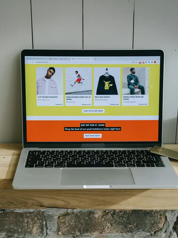
Video is also powerful. A short video can introduce the company, explain a service, show customer testimonials, demonstrate a product, or create emotional connection. Video can increase time on page and improve engagement.
Images should also be optimized. Large image files can slow down the website. Every image should be sized properly, compressed, and named descriptively.
Alt text should be added to important images. This helps accessibility and can support SEO.
Visual content should not be decoration only. It should help tell the story, build trust, and move visitors closer to action.

Chapter 15, Conversion Focused Design
Conversion focused design is the process of designing a website to encourage visitors to take meaningful action. A conversion might be a phone call, form submission, purchase, appointment booking, email signup, donation, or download.
A website can receive a lot of traffic and still fail if visitors do not convert. This is why conversion strategy is so important.
The first step is understanding what conversion matters most. For a local service business, calls and quote requests may matter most. For an online store, completed purchases matter most. For a nonprofit, donations or volunteer signups may matter most.
Once the goal is clear, the website should remove barriers. Barriers include confusing messaging, slow pages, long forms, hidden contact information, weak calls to action, lack of trust signals, unclear pricing, poor mobile experience, and too many distractions.
Forms should be simple. Only ask for information that is truly needed. Long forms can reduce submissions, especially on mobile. If more information is needed later, it can often be collected after the first contact.
Trust signals should appear near conversion points. For example, near a contact form, you might include a short testimonial, review rating, guarantee, or statement about response time.
Benefits should be clear. Visitors should understand what they gain by taking action. Instead of focusing only on features, explain outcomes. A feature describes what you provide. A benefit explains why it matters.
For example, Same day appointments is a feature. Get help today without waiting days for service is a benefit.
Conversion focused design also requires testing and improvement. Small changes to headlines, buttons, forms, layout, or offers can increase results. The best websites are improved over time based on data.
A conversion focused website does not pressure visitors. It helps them feel confident and makes the next step easy.
Chapter 16, Analytics and Measuring Success
A website should not be judged only by how it looks. It should be measured by how well it performs.
Analytics tools help business owners understand what visitors are doing. They can show how many people visit the site, where they come from, which pages they view, how long they stay, and what actions they take.
Important metrics include traffic sources, page views, bounce rate, engagement time, conversion rate, form submissions, phone clicks, popular pages, exit pages, and device usage.
Traffic sources show where visitors come from. They may come from search engines, social media, paid ads, email campaigns, referrals, or direct visits. Understanding traffic sources helps businesses decide where to invest marketing efforts.
Conversion tracking is especially important. A website may have traffic, but if it does not generate leads or sales, something needs improvement. Tracking form submissions, phone calls, purchases, bookings, and downloads helps measure real business results.
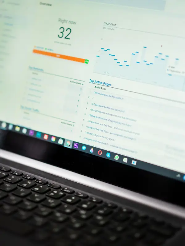
Popular pages show what visitors care about most. These pages may deserve more calls to action, stronger content, or better internal links.
Exit pages can reveal where visitors leave. If many visitors leave from a pricing page, service page, or checkout page, there may be confusion or friction.
Device data shows whether visitors use mobile, desktop, or tablet. If mobile traffic is high but mobile conversions are low, the mobile experience may need improvement.
Analytics should be reviewed regularly. A website should evolve based on real behavior, not guesses.
Data helps turn web design into an ongoing improvement process.

Chapter 17, Common Web Design Mistakes
Many websites fail because of avoidable mistakes. Understanding these mistakes can help businesses create stronger websites.
One common mistake is unclear messaging. If visitors cannot quickly understand what a business does, they may leave. The homepage should communicate the main value clearly.
Another mistake is poor mobile experience. A website may look good on desktop but be difficult to use on a phone. Since many visitors use mobile devices, this can seriously hurt results.
Slow loading speed is another major problem. Visitors do not want to wait. Slow websites reduce trust, increase bounce rates, and lower conversions.
Weak calls to action are also common. If visitors do not know what to do next, they may do nothing. Every important page should guide visitors toward a clear next step.
Too much clutter can also hurt performance. Some websites include too many sections, colors, buttons, popups, animations, or messages. This overwhelms visitors. Clear and simple design often works better.
Low quality content is another issue. Thin pages with little useful information may not rank well and may not convince visitors. Each important page should provide enough detail to help people make decisions.
Ignoring SEO is a major mistake. A website should be built with search visibility in mind from the beginning. Adding SEO later can be more difficult and less effective.
Using generic images can also weaken trust. Visitors often respond better to real photos of the team, location, products, and work.
Another mistake is failing to update the website. Outdated information, old photos, broken links, and expired promotions make a business look careless.
Finally, many businesses fail to measure results. Without analytics, they do not know what is working or what needs improvement.
Avoiding these mistakes can greatly improve website performance.
Chapter 18, Future Trends in Web Design
Web design continues to evolve as technology, search behavior, and customer expectations change. Businesses that stay aware of trends can gain an advantage, but fundamentals should always come first.
Artificial intelligence is becoming more important in web design and marketing. AI can help personalize content, support chat features, improve search experiences, generate content ideas, analyze behavior, and automate customer support. However, AI should support human strategy, not replace it.
Personalized website experiences are also growing. Websites may show different content based on visitor location, behavior, interests, or previous interactions. This can make websites more relevant and effective.
Voice search is another trend. More people use voice assistants to search for information. This means websites should answer natural language questions clearly. FAQ pages, conversational content, and local search optimization can help.

Interactive content is also becoming more common. Calculators, quizzes, assessments, maps, comparison tools, and interactive guides can increase engagement and help visitors make decisions.
Video will continue to grow. Short videos, testimonials, product demos, virtual tours, and educational clips can make websites more engaging.
Accessibility will also become more important. Businesses are expected to create websites that work for all users. Accessible design is not only ethical, it also improves usability.
Speed and performance will remain essential. As websites become more advanced, businesses must avoid adding unnecessary features that slow down the user experience.
The future of web design is not only about looking modern. It is about being useful, fast, personalized, accessible, trustworthy, and easy to use.
Trends should be used carefully. A trendy website that is slow, confusing, or unclear will not perform well. The strongest websites combine modern tools with timeless principles.

Chapter 19, Website Launch Checklist
Launching a website is an important step, but it should not be rushed. A launch checklist helps prevent problems that could hurt performance, rankings, or user experience.
Before launch, test the website on multiple devices. Check desktop, tablet, and mobile views. Make sure the design looks good and functions properly on different screen sizes.
Test all forms. Submit each contact form, quote request form, newsletter form, and booking form. Confirm that notifications are delivered to the correct email address and that users see a confirmation message.
Check all links. Broken links frustrate users and hurt credibility. Review navigation links, internal links, footer links, buttons, social media links, and external links.
Review page speed. Compress images, enable caching, remove unnecessary scripts, and make sure hosting is performing well.
Check SEO basics. Each important page should have a unique title, meta description, clear heading, optimized content, internal links, and readable URL.
Set up analytics and conversion tracking. Without tracking, it will be difficult to measure success after launch.
Install security features. Confirm that SSL is active, backups are configured, updates are completed, and login security is in place.
Review content carefully. Check spelling, grammar, phone numbers, addresses, pricing, service descriptions, staff names, and legal information.
Test the website in different browsers. A website may look slightly different in Chrome, Safari, Edge, and Firefox. Important features should work properly across major browsers.
Create a backup before launch. If anything goes wrong, a backup can help restore the site quickly.
After launch, continue monitoring. Watch for errors, broken links, slow pages, form issues, indexing problems, and traffic changes.
A successful launch is not the end of the process. It is the beginning of ongoing improvement.
Chapter 20, Long Term Website Success
A website is never truly finished. It should grow and improve over time. Businesses that treat their websites as living assets often see better long term results.
After launch, continue publishing helpful content. New articles, service pages, case studies, videos, FAQs, and location pages can improve search visibility and provide value to visitors.
Review analytics regularly. Look for pages that perform well and pages that need improvement. Use data to guide decisions.
Update old content. Information can become outdated. Refreshing pages can improve accuracy, trust, and SEO performance.
Improve conversion rates over time. Test new headlines, calls to action, forms, page layouts, offers, and trust signals. Small improvements can create meaningful results.
Monitor competitors. Competitors may add new pages, improve design, publish content, or strengthen their SEO. Knowing what competitors are doing can help you stay ahead.
Keep the website secure. Continue updating software, checking backups, monitoring threats, and protecting visitor information.

Ask customers for feedback. Real customers can reveal confusing parts of the website, missing information, or questions that should be answered.
Continue improving mobile experience. As mobile behavior changes, the website should remain easy to use.
A long term website strategy should include content, SEO, performance, security, design updates, conversion optimization, and analytics.
The businesses that win online are usually not the ones that launch a website and ignore it. They are the ones that keep improving.
Final Thoughts
Successful web design is much more than creating a good looking website. It requires a thoughtful strategy that combines design, content, speed, mobile usability, SEO, trust, accessibility, security, analytics, and conversion planning.
A website should help visitors quickly understand your business, trust your expertise, find the information they need, and take the next step with confidence. Every page should have a purpose. Every section should support the visitor journey. Every call to action should make progress easier.
The best websites are clear, helpful, fast, professional, and focused on the user. They do not simply talk about the business. They solve visitor problems. They answer questions. They remove doubt. They create confidence.
When a website is designed correctly, it becomes one of the most valuable tools a business owns. It can attract new visitors, support sales, build credibility, generate leads, improve customer service, strengthen branding, and create long term growth.
Whether you are starting from scratch or improving an existing website, the principles in this guide provide a strong foundation. Begin with purpose. Build around the visitor. Focus on clarity. Make the site fast and mobile friendly. Create helpful content. Optimize for search. Build trust. Track performance. Continue improving.
A successful website is not built by accident. It is built through strategy, testing, and ongoing improvement.
Your website should work as hard as you do. When designed well, it can become a powerful 24 hour representative for your business, helping customers find you, trust you, and choose you.
Subscribe for the latest updates, exclusive offers, and industry insights delivered straight to your inbox.
SEOONE is your all-in-one AI-powered tool to audit, optimize, and boost your website’s SEO performance with speed and precision.
© Copyright 2026, SEOONE. All rights are reserved.

